Interior decorating

Black Bear Burritos' Fresh New Look

Closed for Covid

Closed for Covid

One thing that really struck me about the Covid-19 pandemic is just how universal its effect was. Bad or good, it changed something for virtually everyone. Here in Morgantown we lost an institution when Black Bear Burritos closed its original downtown location last winter. My friends and I watched our kids grow up in that place. For years, it was the only spot in town that offered tasty, healthy food, live music that drowned out the kids’ noise, AND delicious craft beer (which made us care a little less when our kids ran around like banshees, hid under benches, and shook the candy dispenser repeatedly while we ate our dinner).

Entrance Before

Entrance Before

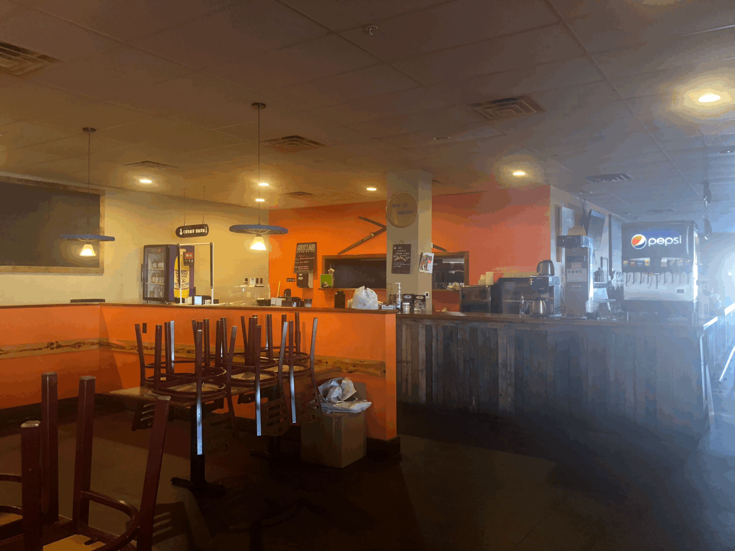
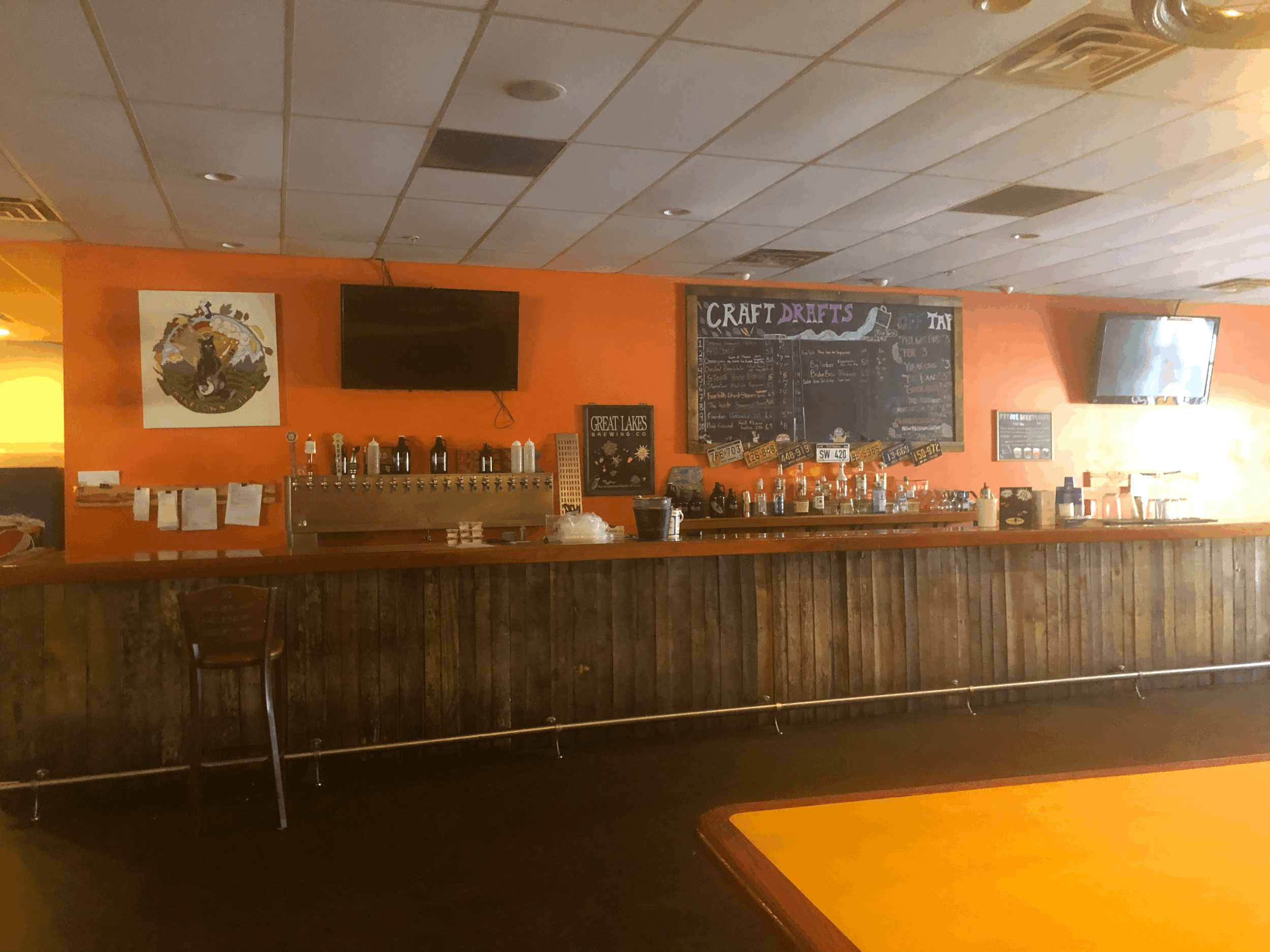
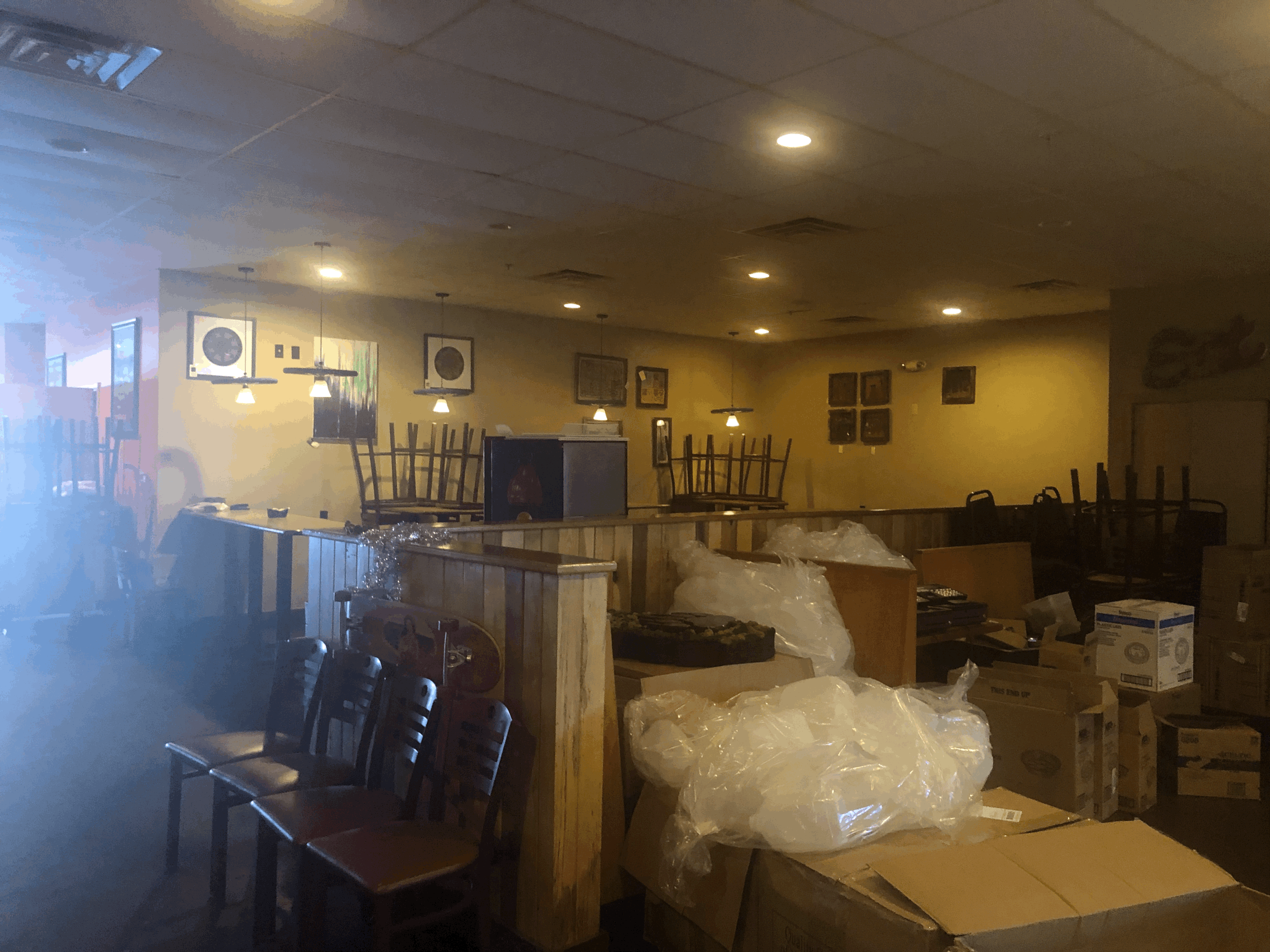
Lucky for us, Black Bear’s second location lives on across town. And while the closing of the original saddened many, many people, it also opened the door for something new. The owners decided to turn the extended closure caused by Covid into an opportunity for a refresh. Though the Evansdale restaurant was vibrant and successful in its own right pre-Covid, the “Before” pictures you see here show it in its take-out only phase, filled with much of the art and memorabilia they’d collected in 17 years downtown, as well as extra kitchen equipment, signs, and seating. Those of you who know me well can surely imagine my excitement when Jason and Matt told me earlier this year that I could help pick paint colors and move some art around. I could hardly wait to get started.

The first thing I did was to research what colors work best in restaurants. I found multiple articles (such as this one) about the psychology of colors and why and where they should be used. (Red and yellow make you want to eat fast and leave. Using green in a bar makes people feel ill. Orange makes you want to indulge.) Based on my research, I decided to keep the vibrant orange that was already behind the bar (Have another beer!) but bring in another color to tone it down a bit. I liked the idea of green, both because it’s in their logo and because it’s associated with fresh, healthy food. (While they’ve got enough meat and cheese to satisfy any carnivore (even weekly burger specials), they’re one of the few places here that offers plenty of veggies, plus beans, tofu, and jackfruit. I think that’s worth highlighting.)

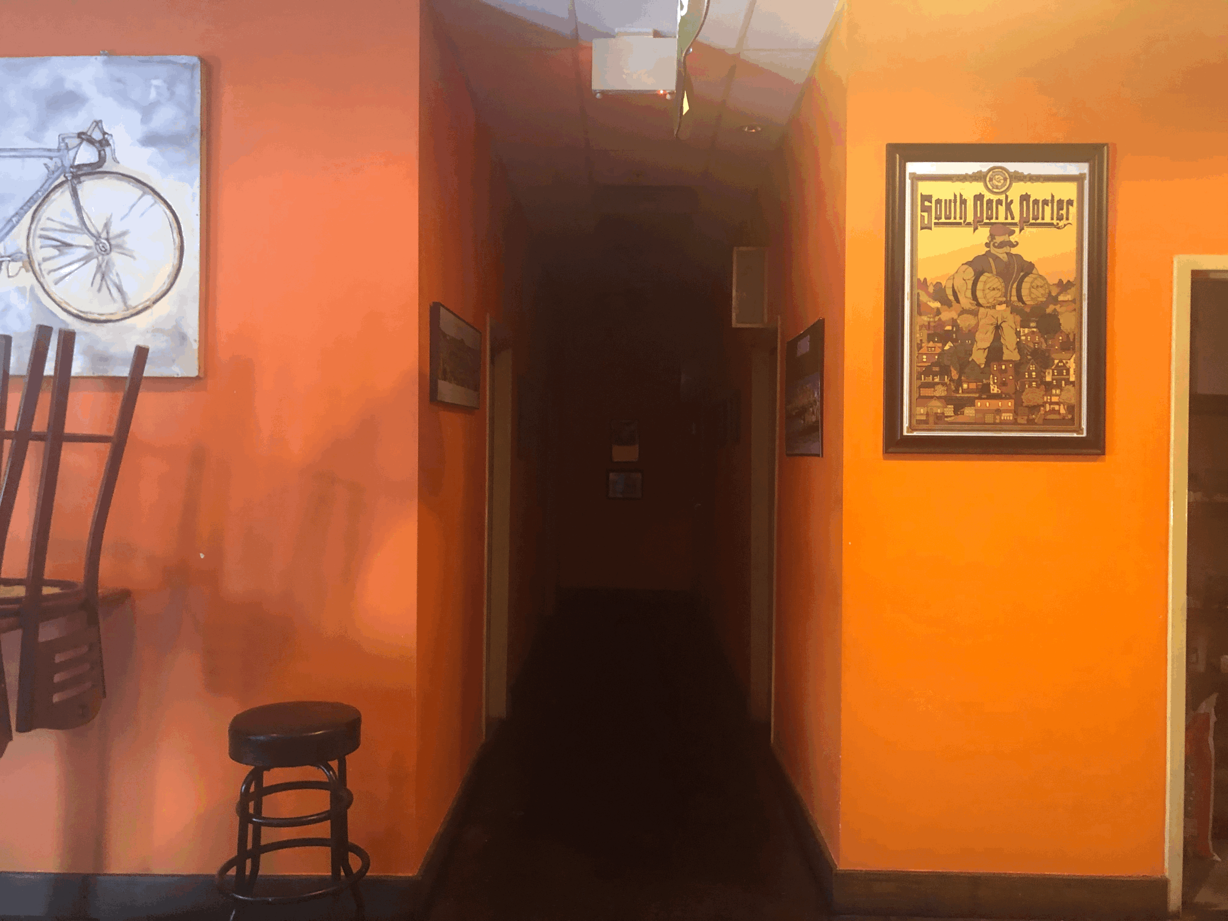
Entrance Before, with test colors

Entrance Before, with test colors

I pride myself on my eye for color, so I surprised myself a little when I painted three shades of green on the walls and liked none of them. I returned to the Chestnut Brew Works Halleck poster that hangs in the bar area, which had been my original color palette inspiration, and then headed back to Lowes for more samples.

tempImageWOYLMo.gif

The second time was a charm: everyone liked the next round of greens. And so the refresh began. Fast forward several months, and I’ve since painted all but two walls in the restaurant, helped hang almost all the art, and added some paint and plants to the patio. It’s the most fun I’ve had in a long time. Along the way, I also designed a Black Bear sticker and photographed the entire menu for their new online ordering system. This is my first commercial gig, and let me tell you, I loved every minute of it.

tempImageElvJ4x.gif
Black Bear After (53 of 75).jpg
Black Bear After (62 of 75).jpg

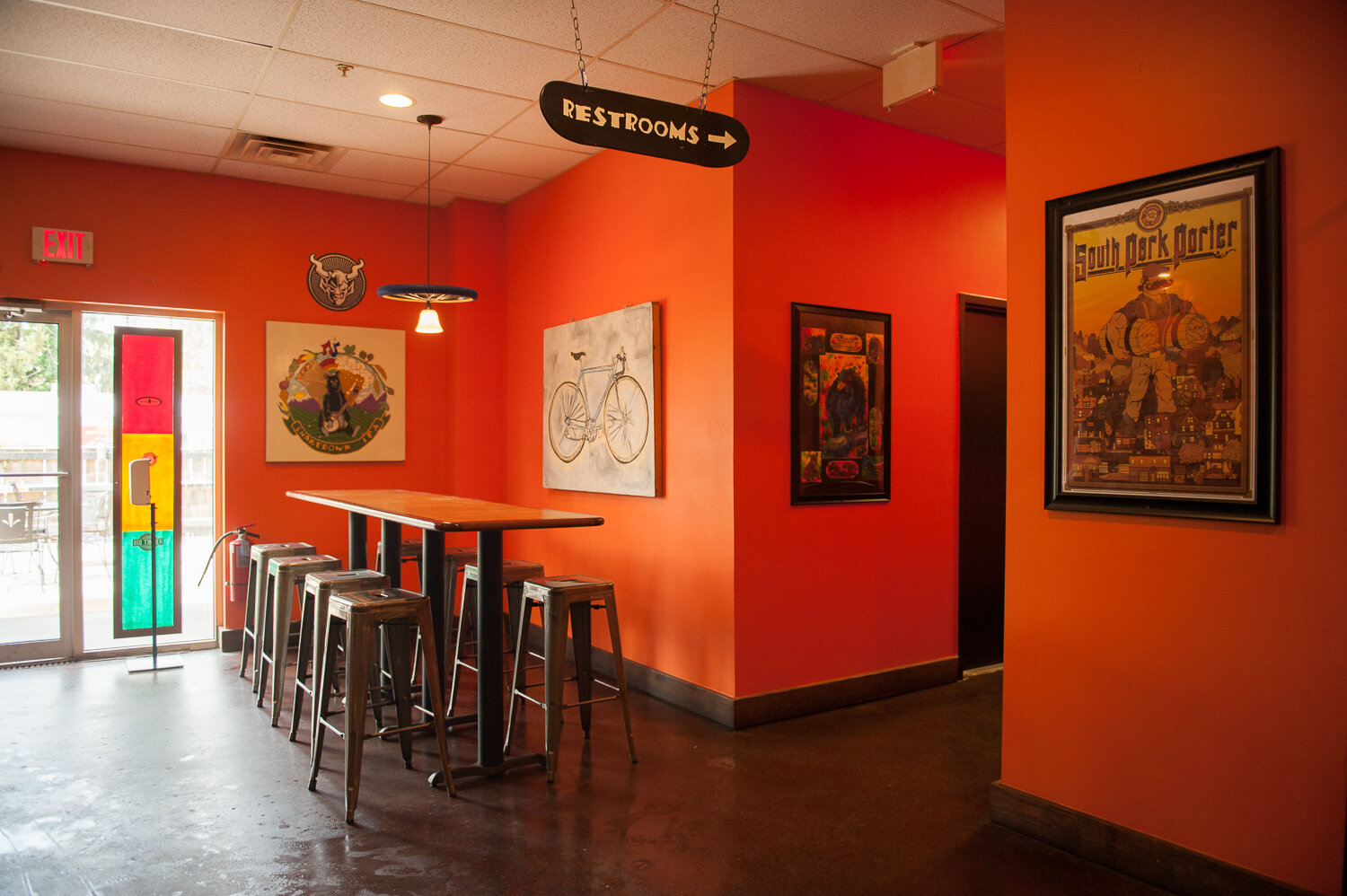
I painted the walls at the entrance green to give it more of a presence. Jason hung four stained glass pieces from downtown in the windows and enlisted the help of the arborist who created the wall covering of circular wood cuts downtown to re-construct it on the first wall you see when you walk in. It really sets the tone. I like how the warm wood pops against the green backdrop.

Black Bear After (59 of 75).jpg
Black Bear After (2 of 75).jpg

I continued the green from that wall onto the two walls that lead to the counter where you place your order but left the orange on the low wall beside the booths for a nice contrast. I was pleasantly surprised by how much this change made both the bicycle tire lights (sponsored by Pathfinder) and the Eddie Spaghetti mural on the low wall stand out.

tempImage5pHobx.gif
Black Bear After (6 of 75).jpg
tempImagePhcRT1.gif
Black Bear After (10 of 75).jpg
Black Bear After (9 of 75).jpg
Black Bear After (5 of 75).jpg
tempImageYdee8E.gif

Jason had the idea of painting the big square pillar behind the counter turquoise, to tie into the accent wall we did across the restaurant. We hung the bold bear paw paintings created by Jason’s artist buddy Ryan Lincicome on the entrance wall and behind the counter and put an awesome new Eddie Spaghetti bike print on the pillar.

tempImaged5fl4i.gif

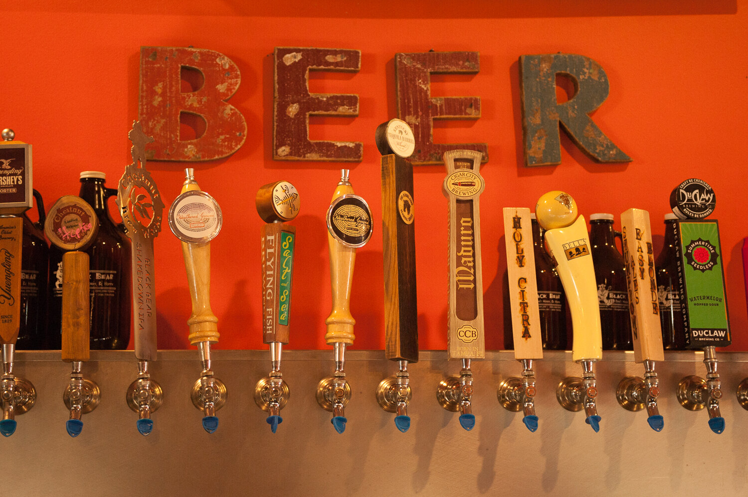
We filled the wall behind the bar with brewery signs and other bar-related kitch and switched out the booths for high-tops to create a more cohesive feel. I painted the wall at the far end of the bar area orange too, as well as the wall that wraps around into additional seating to designate that whole side of the restaurant as the “bar area.”

Black Bear After (52 of 75).jpg
Black Bear After (50 of 75).jpg
Black Bear After (43 of 75).jpg
tempImage7ZGo05.gif
Black Bear After (39 of 75).jpg
tempImageFis2xs.gif

I also rehung some of the existing art, moving it down a bit to make the space feel more intimate.

Black Bear After (71 of 75).jpg
tempImageMPtcpn.gif

We added a turquoise accent wall at the back and painted the wooden silhouette of musicians (by Roland Hunn) black to make it pop against the orange.

Black Bear After (19 of 75).jpg

In the hall leading to the bathrooms, I hung all their awards and plaques on one wall and a collection of WVU-themed memorabilia on the other. I painted the doors to the bathrooms and offices black to hide dirt and add some contrast.

tempImage8ex1c8.gif
Black Bear After (21 of 75).jpg
tempImagenRsdpz.gif

I painted both bathrooms green and the stalls black and added some art and mirrors.

Black Bear After (27 of 75).jpg
tempImageBFuEQ7.gif

I carried the green around behind the stage, and Jason had a new light installed to shine on the wall to the right, which will eventually hold local artists’ work.

Black Bear After (14 of 75).jpg
tempImageHCMHtc.gif

Jason and Matt decided to incorporate what was once a private dining room into the rest of the restaurant by cutting a large window into the wall it shares with the larger space. I painted two of its walls a warm, glowing yellow and hung all the outdoor-themed artwork in that room together.

Black Bear After (38 of 75).jpg
Black Bear After (35 of 75).jpg

This was by far my biggest project to date. And while I certainly love doing houses, it’s pretty exciting to redo something that everyone in town can see. Want to check it out? Now you can. After a year of serving take-out only, Black Bear is finally back. Doors open for dine-in tomorrow, May 3.

I hope the new decor makes you love your burritos (and burgers and tacos and queso) even more.

Follow

My House: Before and After

When the pandemic first hit, I felt a burst of creative energy. I painted walls, built a giant game of outdoor Jenga, and added my interpretation of barn art to my shed. I took Coban on photo walks and felt inspired.

untitled-46.jpg
untitled-6.jpg
untitled-42.jpg

Fast forward nearly a year, and several months have passed since I last felt like taking out my camera. But I did today because I decided to show you something I’ve been working on for 7.5 years: my house. I like nothing better than a good before and after. So here it goes.

Exterior Before, circa 2013

Exterior Before, circa 2013

The house was white when I found it, like so many others in Morgantown. (I never really noticed that until a friend from Louisiana saw pictures once and asked if there’d been a sale on white paint.) Very cute, I thought, and in that bungalow style I’ve always liked.

Since then I had it painted, put on a new roof, and extended the garden all the way across the front. If you look closely, you can see that the mulch on the hill stopped awkwardly halfway across before. My neighbor gave me a few of the yellow flowers in the photo below, and they spread like crazy. Just what I need on a hillside that’s almost too steep to weed.

Exterior After

Exterior After

Kitchen Before

Kitchen Before

Kitchen After

Kitchen After

The kitchen is probably the room I’ve changed the least in the whole house. I put in this new pendant light over the sink (and when I say me, I mean my kind friend Genesis) and painted the walls, but everything else is pretty much the same. I still like the maple Shaker cabinets, dated as they may be.

Dining Room Before

Dining Room Before

Kitchen to Dining Room After

Kitchen to Dining Room After

The dining room brightened up quite a bit with new grey paint. The faux wallpaper was a Covid-era addition. Turns out I had a $3 sample paint in the basement that matched my recently painted green cabinet perfectly. I kept the silver pendant lights over the bar for years until I changed them out a couple years ago for slightly larger, more shapely red pendants.

Living Room Fireplace Before

Living Room Fireplace Before

Living Room Fireplace After

Living Room Fireplace After

Living Room Fireplace After (before the logs got soaked with soot and leaking water)

Living Room Fireplace After (before the logs got soaked with soot and leaking water)

The previous owners had modernized the fireplace by covering it in drywall and adding a new mantel, but it felt a little bare to me. It was just begging for some built-in shelves to flank it, as you often see in Craftsman bungalows. Luckily, my dad is an excellent woodworker, and he built them to fit.

For several years I filled the empty fireplace (no longer functional, sadly) with logs from a dead pear tree Dad cut down in my yard. But I took them all out when water and soot rained down on them several years back. The giant mirror I found in my childhood attic does a nice job of hiding the empty hole and reflects light from the window across the room.

Living Room Before

Living Room Before

Living Room After

Living Room After

This living room is a good example of how a few changes can go a long way. I opened it up by making two seating areas—one facing the TV and another flanking the fireplace. I painted the walls grey and the staircase and baseboards white to match the rest of the trim. I tried to minimize the effect of the giant television (it came with the house) by hanging art all around it. I kept the existing curtain rod but moved it up and hung very long Ikea curtains that span from floor to ceiling.

Sunroom Before

Sunroom Before

Sunroom After

Sunroom After

The sunroom stayed as it was for years until finally I painted it the same grey as the rest of the downstairs, which helped tie everything together. My stepdad and I installed laminate flooring last year after I impulsively ripped out all the carpet (that still smelled from my dog Roux, nearly 6 years after she died). Good thing too, as Coban and I are both using this room most days now for work and school. Rehanging the curtain rods and getting longer curtains made a huge difference here too.

Stairway Before

Stairway Before

Stairway After

Stairway After

I decided to leave a “runner” of natural wood on the stairs because I know how scuffed painted stairs can look. Having the white along the side of the treads also helps ease the transition between the painted baseboard and railing and the unpainted stairs.

Coban’s Room Before

Coban’s Room Before

Coban’s Room After

Coban’s Room After

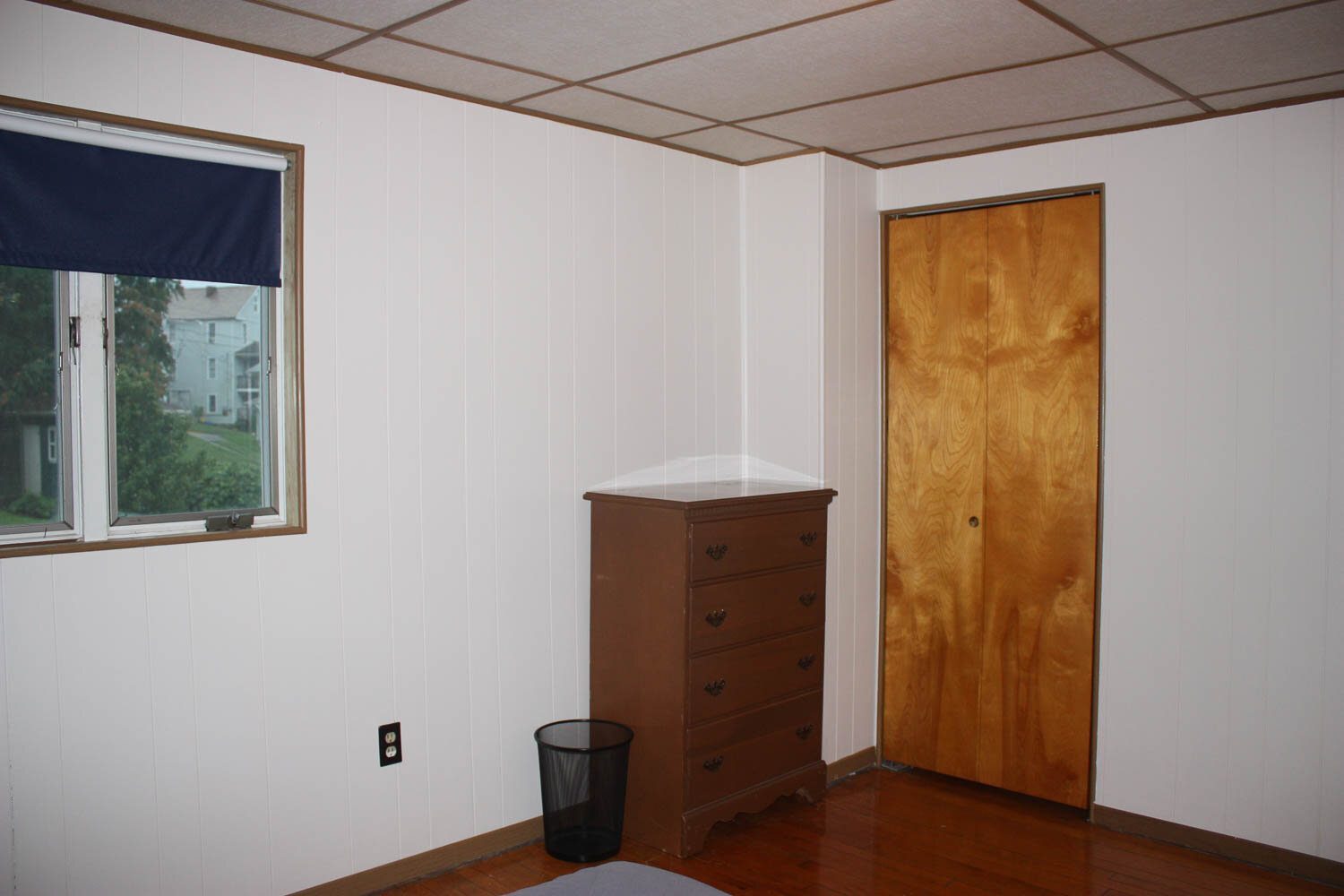
One of the first things I did when I moved in was to hire contractors to install fake bead board on the ceilings upstairs, as well as new baseboards and trim around the windows. (I priced drywall too, but it was ungodly expensive.) The previous owners had done a lot of work downstairs, but the bedrooms still had drop ceilings with brown plastic pieces separating each tile, and there was no trim around the doors or windows. With new ceilings and trim, the existing paneling on the walls suddenly looked charming and cottagy.

My Bedroom Before

My Bedroom Before

My Bedroom After

My Bedroom After

The biggest design issue in my room is that the window is not centered in its space. Once I hung curtains on either side, you can’t tell at all.

Bathroom Before

Bathroom Before

Bathroom After

Bathroom After

I wanted to try a dark, dramatic bathroom look, and this one has enough natural light to pull it off. It came with gold fixtures, which is not what I’d choose, but I decided to keep them after I priced new towel racks and faucets. To make it work, I got a bunch of gold frames from junk stores and filled them with posters and art from calendars. I found a little chandelier for $10 at a flea market, which seemed fitting with the clawfoot tub and the “fancy” gold frames.

Bathroom Sink Before

Bathroom Sink Before

Bathroom Sink After

Bathroom Sink After

I replaced the pedestal sink with an Ikea vanity, which offers a lot more storage and a place to set things down. I just couldn’t bring myself to buy a gold faucet and went with silver instead. I spray painted the towel racks to match and found the mirror at TJ Maxx for $25.

Back Porch Before

Back Porch Before

Back Porch After

Back Porch After

When I moved in, the back porch (which is our main entry) was covered in astroturf. Its walls were clad in a mix of aluminum and vinyl siding that didn’t match the rest of the house. My stepdad and I ripped all that out and replaced the floor with deck boards. We put shakes on the walls and built a privacy screen at the back. Two new lights and a new mailbox, and voila. It may be a carport porch, but we use this space a LOT. It’s like having an extra outdoor room.

And there you have it. My house is pretty much done. I’d move to a new one if I could just to do it all again, but that’s not in the cards just yet. Which means I need new projects! I’ve got one big one in the works, which I’ll be sharing as soon as it’s finished. Stay tuned! (It’s pretty exciting.)

Follow